Topic: Non-Sliders Appearances of the Interdimensional Font
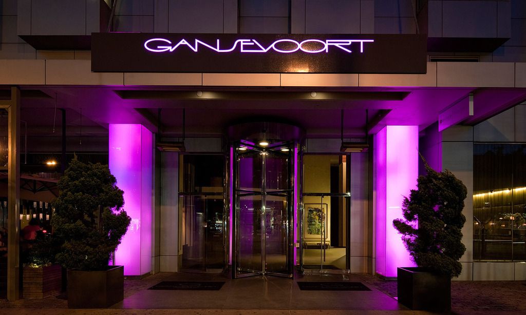
Gansevoort hotel, Meatpacking district, Manhattan.

I've passed this hotel before, never noticed it!
Sliders.tv → Sliders Bboard → Non-Sliders Appearances of the Interdimensional Font
Gansevoort hotel, Meatpacking district, Manhattan.

I've passed this hotel before, never noticed it!
It's a sign! The sliders must meet there 29.7 years after their last slide!!!
![]()
There's store called "The Shop" that I saw at the Sawgrass Mall in Florida which uses the font. I have no idea how to post a picture of it here though.
I use Photobucket, it's free.
So what's the history of this font? Did it exist before Sliders?
I don't know it's origins but it's stretched, big friendly lettering are appealing even when not on Sliders OP Credits.
The picture of "The Shop" I mentioned above is posted on the Slideheads Facebook page if you want to see it.
I don't know it's origins but it's stretched, big friendly lettering are appealing even when not on Sliders OP Credits.
"Talented Dutch graphic designer Anthony De Meester created this light, elegant sans serif typeface. Although simplicity is the hallmark of this design, it can be used most effectively where a look of regal elegance is desired.
Designers: Anthony de Meester
Design date: 1989
Publisher: Letraset
MyFonts debut: Mar 17, 2003"
I was watching season 2, episode 19 of "Young and Hungry" on Netflix earlier today, and Sophia was wearing a t-shirt with the words "Soul Spin" in the Sliders font on the front of the shirt.
I'm pretty sure it's on the car, Kia SOUL. It's a bit more rounded-out but it looks practically just like it.
I'm pretty sure it's on the car, Kia SOUL. It's a bit more rounded-out but it looks practically just like it.
This is the Kia Soul font:

'Tis very similar indeed!
Sliders.tv → Sliders Bboard → Non-Sliders Appearances of the Interdimensional Font
Powered by PunBB, supported by Informer Technologies, Inc.